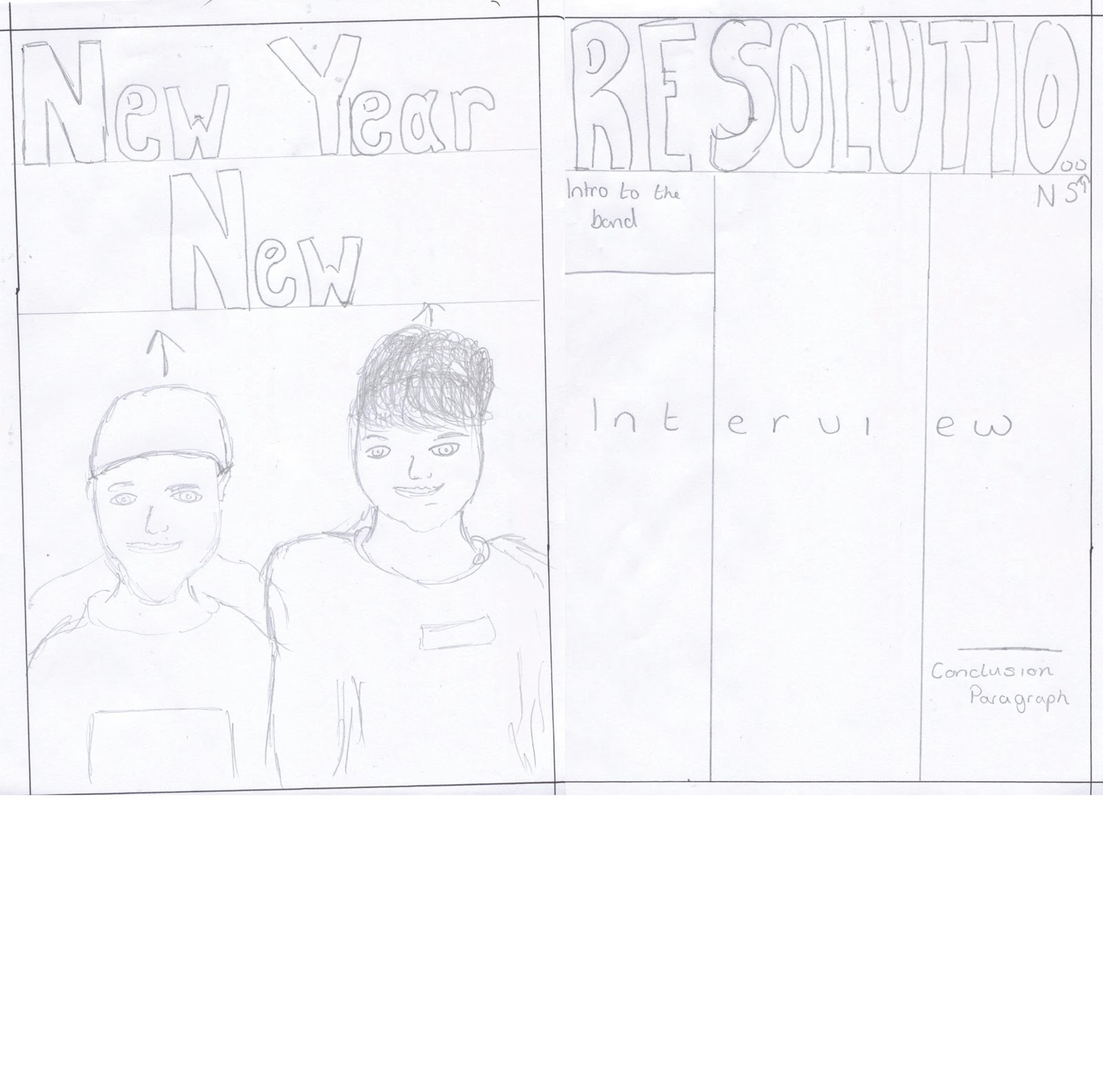
This is the first front cover that I created. It contains many common conventions such as;
Price and date
A tag line
A logo
A central image.
However, I realised that the layout is un-organised and unprofessional. It does not make the magazine stand out nor does it look attractive. I think that the main problem was that it was far too empty, there is nothing on it besides the main image and the main feature of the edition, I had to quickly develop new ideas and created new drafts.
Thursday, 25 April 2013
Initial - Double Page
This was the first attempt at actually creating my double page spread. After both self, and peer evaluation I quickly realised that there was many things wrong with it such as;
Image choice
Background colour
Font and Font size
I later came to change these things, improving and adding things as I developed it.
Image choice
Background colour
Font and Font size
I later came to change these things, improving and adding things as I developed it.
Initial Attempt at Layout
I tried to replicate what I had drafted on programmes such as InDesign and Photoshop. I begun by looking at my ideas and then playing with layouts, fonts etc. to try and get a grasp of what will really look professional and what will not.
Drafts - Double Page Spread
Above, is my original draft for my music magazine double page spread.
Through my research, I learnt that the majority of music magazine double page spreads share many common conventions (as can be seen in the Research part of my blog.) Some of these conventions include the way in which the pages are set out and the use/types of images on them. From personal research I found that there tends to be one main image which may span across both pages. I decided to use this layout in my own work by planning to get one main image and cropping it out so that it was just the one or two people, I felt that this would draw attention to them (gaze theory) and draw attention away from anything that could of been in the background. I decided early on that I wanted a simplistic type of approach on my double page spread, this is illustrated in my drafts as you can see there are only the main conventions roughly in place such as; a main image, a catchy title, and a section for an article.
Drafts - Contents Page's.
Above, are my two initial drafts for what was to be my contents page.
For my first draft idea (left), I decided to go for a typical contemporary type of music magazine contents page, such as that of: Q and NME. The idea originally was to get as much 'content' on the page as was possible with a number above or to the side of each story/title, with one main 'live' photograph along the bottom of the page, and smaller images else-where on the page. However, after getting my peers' opinions I realised that this was not a proper format of a contents page and therefore would not professional, the large photograph also caused a huge amount of space to be lost which could potentially suggest to the audience that there was not enough content in the magazine to mention.
On my second draft, there was a number of both changes, and additions that were made. Changes included, removing the idea of the large photograph which covered the whole of the bottom of the page for the reasons mentioned above. The idea of having page numbers above or next to each story was also changed as I realised it could get confusing to connect the number to the right story, therefore I decided to have smaller page numbers, with a sort of, tag-line next to them, followed by a small piece of information underneath. I also decided to add a common feature for most magazines, which is a section on competitions or a competition winner, this can be seen bottom right hand corner of the second draft. Further additions included, sectioning the page into; Inside This Week, Specials, Competitions, Whats New With Hardcore, making the page easier to negotiate.
For my first draft idea (left), I decided to go for a typical contemporary type of music magazine contents page, such as that of: Q and NME. The idea originally was to get as much 'content' on the page as was possible with a number above or to the side of each story/title, with one main 'live' photograph along the bottom of the page, and smaller images else-where on the page. However, after getting my peers' opinions I realised that this was not a proper format of a contents page and therefore would not professional, the large photograph also caused a huge amount of space to be lost which could potentially suggest to the audience that there was not enough content in the magazine to mention.
On my second draft, there was a number of both changes, and additions that were made. Changes included, removing the idea of the large photograph which covered the whole of the bottom of the page for the reasons mentioned above. The idea of having page numbers above or next to each story was also changed as I realised it could get confusing to connect the number to the right story, therefore I decided to have smaller page numbers, with a sort of, tag-line next to them, followed by a small piece of information underneath. I also decided to add a common feature for most magazines, which is a section on competitions or a competition winner, this can be seen bottom right hand corner of the second draft. Further additions included, sectioning the page into; Inside This Week, Specials, Competitions, Whats New With Hardcore, making the page easier to negotiate.
Drafts - Front Covers
Above are my first (left) second (right) and third (centre) drafts for my music magazine front page. As you can see throughout the drafts there are many obvious changes, from my original idea's.
My original plan for my front cover, was to represent that of current music magazines of the same or similar genres such as; Kerrang! and AP Magazine. It was to contain one main image of which would take up the majority of the page, by doing this and ensuring that the image used such techniques as Gaze theory, it would attract the audience in to find out what is inside this magazine. When I took my original design onto programs such as InDesign and Photoshop, this common convention worked well, and so I decided to carry it through my further drafting as can be seen above. However, there were certain things that did not look very appealing or attractive, such as the slanted 'Resolutions' title, this did not fit properly with the layout nor did the bar running vertically on the left hand side of the page so on my next draft I removed it.
When doing a second draft I ensured to remove out the items/conventions which I, along with others, felt did not fit in properly. I also begun to add new conventions in, after further research, such as; a smaller more subtle logo and also lures (''10 FREE posters!) I felt this worked well and made the magazine look both more appealing to the target audience and also more professional. I decided however, that before creating my front cover I would create a final draft from which would include all the things that I thought worked well, and losing bits that did not. In my third drafts, more lures were added, most important of them being the list of bands, this would help to attract an audience as they may see a band on the list that they like rather than just seeing one artist that they may not.
Wednesday, 20 March 2013
Draft Photography
Below are a few of my first examples of photography. I have captured a wide range of different types of photography both that I can use as main images and also smaller side images. Some of them, for example; the last one, I will not be able to use as they are out of focus or blurry.
Subscribe to:
Posts (Atom)