http://youtu.be/QAdoLwo4kJE
http://youtu.be/_dWa_FA54JI
Monday, 29 April 2013
Evaluation 5 & 6
What have you learnt about technologies throughout this process and what new things have you learnt?
Throughout the process of working towards my final music magazine, I have learnt the importance of new technologies such as; InDesign and Photoshop, within the world of media. It is imperitive to being able to create products like music magazines, or indeed, magazines in general. It allows us to be able to create and put to life new and fresh ideas.
I have also learnt the importance of using things such as rulers/guidelines and also layers when working with such technologies. Layers are especially important as without properly laying out your deisgns they become easily confused and mixed up, making it very hard to edit the smallest of things quickly. Rulers and guidelines are important as it gives you the ablity to be able to lay things out acurately, for example ensuring an image is central to the page, or that there is equal space both sides of something.
Font, and font colours are something that I have learnt how to use adequately. Throughout this process I have had to try and push myself to use fonts or colours that I would normally try to avoid, in order to make a title, or piece of text, stand out more. I have learnt how important it is to have something (especially on the front cover) of which is sure to attract an audience and give them a reason to pick up the magazine. If the text/font is boring and bland, with no effects, for example; stroke, then it is likely to be ignored.
One very important thing that I have learnt in this process is the importance of time-keeping, and creating/sticking to a schedule. I have learnt that it is so important to lay out a project and stick to it as much as possible, especially when you have a specific deadline, as if you over-run on one thing for example doing drafts then you are then likely to run behind schedule for the rest of the project, making it extremely hard to meet the final deadline.
Evaluation 3
What type of institution would distribute your product?
I feel that an appropriate institution would be a medium-large scale distribution company, perhaps one that distributes nation-wide. An appropriate company would be one such as;
Bauer Media Group - BMG reaches over nineteen million adults (16+ years of age) every week. The company owns extremely well known brands/other companies recognised nation and worldwide such as;
- Kerrang!
- FHM
- Q
- Kiss.fm
- Magic
I feel a company such as this would be appropriate as it deals with a large range of magazines/companies (big and small) from fishing to motoring to almost all types of muisc. The company is renown for its well known music companies, and therefore people may trust my product more. It also reaches the correct target audience, of anyone in the bracket of 16 years of age and up. BMG also already contains magazines/music companies of similar music genres, whilst this could potentially rivial my product it could also help it fit in with the already well established audience.
Final - Music Magazine


Above you can see my final music magazine pages. As is shown in earlier blog enteries, I have reached this stage through research, peer and self feedback, and on-going editing.
Thursday, 25 April 2013
Second Front Cover and Contents Page

On retrospect, this attempt also lacks conventions such as puffs and tag lines however the change of layout dramatically affected how the cover looked, by removing the vertical red bar which served no purpose, making the top bar one continous white bar and playing the cover feature in a better way making it stand out. The contents page continues the house theme of black and red, and contains common conventions such as; an editors note, stories/features, page numbers and sections. Feedback from peers suggested that it was easily understood and easy to find things, both important positives for a contents page.
First Front Cover

Price and date
A tag line
A logo
A central image.
However, I realised that the layout is un-organised and unprofessional. It does not make the magazine stand out nor does it look attractive. I think that the main problem was that it was far too empty, there is nothing on it besides the main image and the main feature of the edition, I had to quickly develop new ideas and created new drafts.
Initial - Double Page

Image choice
Background colour
Font and Font size
I later came to change these things, improving and adding things as I developed it.
Initial Attempt at Layout

Drafts - Double Page Spread
Through my research, I learnt that the majority of music magazine double page spreads share many common conventions (as can be seen in the Research part of my blog.) Some of these conventions include the way in which the pages are set out and the use/types of images on them. From personal research I found that there tends to be one main image which may span across both pages. I decided to use this layout in my own work by planning to get one main image and cropping it out so that it was just the one or two people, I felt that this would draw attention to them (gaze theory) and draw attention away from anything that could of been in the background. I decided early on that I wanted a simplistic type of approach on my double page spread, this is illustrated in my drafts as you can see there are only the main conventions roughly in place such as; a main image, a catchy title, and a section for an article.
Drafts - Contents Page's.

For my first draft idea (left), I decided to go for a typical contemporary type of music magazine contents page, such as that of: Q and NME. The idea originally was to get as much 'content' on the page as was possible with a number above or to the side of each story/title, with one main 'live' photograph along the bottom of the page, and smaller images else-where on the page. However, after getting my peers' opinions I realised that this was not a proper format of a contents page and therefore would not professional, the large photograph also caused a huge amount of space to be lost which could potentially suggest to the audience that there was not enough content in the magazine to mention.
On my second draft, there was a number of both changes, and additions that were made. Changes included, removing the idea of the large photograph which covered the whole of the bottom of the page for the reasons mentioned above. The idea of having page numbers above or next to each story was also changed as I realised it could get confusing to connect the number to the right story, therefore I decided to have smaller page numbers, with a sort of, tag-line next to them, followed by a small piece of information underneath. I also decided to add a common feature for most magazines, which is a section on competitions or a competition winner, this can be seen bottom right hand corner of the second draft. Further additions included, sectioning the page into; Inside This Week, Specials, Competitions, Whats New With Hardcore, making the page easier to negotiate.
Drafts - Front Covers

Above are my first (left) second (right) and third (centre) drafts for my music magazine front page. As you can see throughout the drafts there are many obvious changes, from my original idea's.
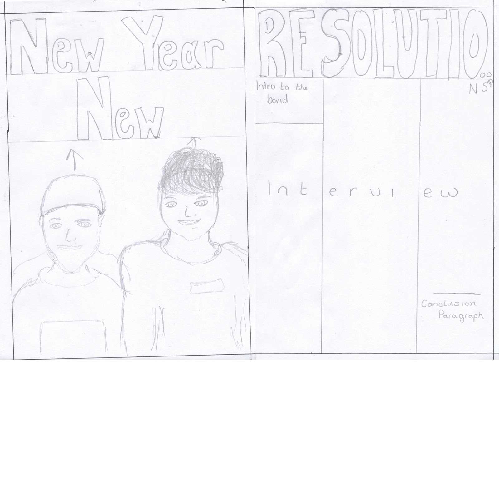
My original plan for my front cover, was to represent that of current music magazines of the same or similar genres such as; Kerrang! and AP Magazine. It was to contain one main image of which would take up the majority of the page, by doing this and ensuring that the image used such techniques as Gaze theory, it would attract the audience in to find out what is inside this magazine. When I took my original design onto programs such as InDesign and Photoshop, this common convention worked well, and so I decided to carry it through my further drafting as can be seen above. However, there were certain things that did not look very appealing or attractive, such as the slanted 'Resolutions' title, this did not fit properly with the layout nor did the bar running vertically on the left hand side of the page so on my next draft I removed it.
When doing a second draft I ensured to remove out the items/conventions which I, along with others, felt did not fit in properly. I also begun to add new conventions in, after further research, such as; a smaller more subtle logo and also lures (''10 FREE posters!) I felt this worked well and made the magazine look both more appealing to the target audience and also more professional. I decided however, that before creating my front cover I would create a final draft from which would include all the things that I thought worked well, and losing bits that did not. In my third drafts, more lures were added, most important of them being the list of bands, this would help to attract an audience as they may see a band on the list that they like rather than just seeing one artist that they may not.
Wednesday, 20 March 2013
Draft Photography
Below are a few of my first examples of photography. I have captured a wide range of different types of photography both that I can use as main images and also smaller side images. Some of them, for example; the last one, I will not be able to use as they are out of focus or blurry.


Thursday, 7 March 2013
Double Page Spread - Content Research
Content Research
Through my research so far, I have been able to gain an understanding of the type of content that is included on a double page spread, and also the way in which the text is written. For the most part, music magazines such as; AP Magazine, review and talk about music on a fairly informal level by which their readers can easily engage with. The formality of the text, is quite casual and often even contains colloquial language, this makes the articles much more personal in a way as it asthough it has been written for a specific audience.
Below is the link for my 'Music and Reviews' blog, as a way to develop my writing and anilitical skills, I run a seperate blog in which I aim to weekly write reviews on bands or new EP's/albums that I have listened to. Through a mixture of reading music magazines/articles and trying to do my own write-ups I am able to develop my skills further to make my music magazine as professional as possible.
http://reviewthornton.blogspot.co.uk/
Wednesday, 6 March 2013
Examples of Pop-punk
Music Examples
Below are links to some currently well known, and well respected bands within the genre. From these music video's and tour diaries we are able to grasp an idea of what typical band members are like, what its like to be on tour and also what the shows they play are like to attend.
Below are links to some currently well known, and well respected bands within the genre. From these music video's and tour diaries we are able to grasp an idea of what typical band members are like, what its like to be on tour and also what the shows they play are like to attend.
What Is Pop-punk?
History and Culture
Pop-punk, is a fusion of two main music genres of 'punk rock' and 'pop music.' When brought together the combined genres create pop-sounding melodies with speedy punk tempo's, pounding drums and loud guitars. The first bands to break through the scene and make the new hybrid genre known, were such bands as Green Day (1987) and Blink182 (1992).


Pop-punk, is a fusion of two main music genres of 'punk rock' and 'pop music.' When brought together the combined genres create pop-sounding melodies with speedy punk tempo's, pounding drums and loud guitars. The first bands to break through the scene and make the new hybrid genre known, were such bands as Green Day (1987) and Blink182 (1992).

As you can see from the above images, the first bands to establish the 'pop-punk' genre were perhaps not in alignment with most of society. The picture of Blink182 (second picture) shows 3 men who all have their tops off, are all pulling immature faces and two of which have many in-your-face tattoo's. Tattoo's have been increasingly more acossiated with rebelion against society or even parents, which is often what the culture of the genre is about; non-conformity, rebellion and just having fun.
Through recent years, these ethics and morals have been carried with every new band that breaks the scene. Every band however, has their own set of morals and teachings to get through to their fans, through lyrics. More recently pop-punk bands such as Man Overboard, The Story So Far and Transit, are focused on thoughts and feelings of ex-girlfriends/boyfriends, family, friends and society in general who have hurt or disarded them in some way or another, through bitter feelings of discontent.
An example of lyrics which talk angrily about someone, comes from the song 'Rally Cap' by The Story So Far(TSSF);
''You leave me in the deep end with ankles made of bricks, But I'm used to dealing with crooks and p***ks, they fill the minutes while the clock ticks.''
According to TSSF frontman, Parker cannon the song is about friends who just leave you without explanation and leave you to deal with everything on your own. It is also about having to deal with 'fake-people' those who want to bring you down. This is a common theme throughout modern pop-punk, those who sing in bands within the genre are usually have lyrics about past experiences that have upset them, people they hate or even feelings about themselves. I believe for the most part, if you attend a pop-punk concert you will experience a sense of 'family' as everyone is there to enjoy the same thing, perhaps people share similar experiences, they are alike.
Monday, 4 March 2013
Research - Collage
I have decided to create a collage to show common themes of the music genre of 'Pop-punk' that I am focusing on. In this collage you can see a mixture of; band members, album artwork and fans/shows. From this it is easy to gain an understanding of the culture of the genre, it is quite casual and fun, the band members are never 'fashion conscious' or smartly dressed. The shows that the bands play are usually in small venues and the fan's come together to enjoy it, as a sort of 'family'.


Sunday, 3 March 2013
Research
Before I could begin any sort of planning for my own music magazine, I first had to do research into other current magazines so that I could then gain an understanding of common conventions, house sytles etc.


Thursday, 28 February 2013
G321 Main Task
To design and create a front cover, contents page and double page spread for a music magazine.
Thursday, 7 February 2013
Magazine Front Cover and Contents Page
Below is my final, completed, front cover and contents page for my Trinity School magazine. Over time I have done extensive research and worked from an original draft/plan, editing, arranging, deleting and changing items and features to make my magazine look as professional and life-like as possible.


Drafts
Drafts
Below are my three main drafts for my magazine. You can see from the order that they are placed in that over time I have worked hard to improve on my simplistic original idea. Over time things have been added, removed and adjusted to make my magazine look as good as possible, an example of this is the bottom arched title on the first draft, after trying it out on Indesign I realised that it would not be possible as it left too much empty space, therefore I took this into consideration for the second draft, rearranging the title to a less complicated way. All features from my first draft have remained in all three but they have just been slightly manipulated or placed differently, also the main photograph has been changed to a more effective one. The bottom draft is my final one and is also the one that lead to my final magazine front cover and contents page.


Photographs
Selecting My Photographs
Here is a screen shot of some of my photographs. When I went out around the school sites to pre-arranged places, I took a lot more than I actually needed. The purpose of this was so that I could go through them later on and delete any blurt/un-needed ones and just take away the good ones that could be applied to my magazine, I originally had around 140-150 photographs but after editing and deleting I got them down to roughly 34.

Wednesday, 16 January 2013
Audience and Institution
Audience
My magazine is created and designed for a school institution, and in specific the sixth form which is usually people from l6 years of age to 18. Taking this into account I have ensured that certain aspects such as pictures and wording are targeted at that age range whilst also keeping in mind that other years of different ages may also be seeing it therefore also making sure pictures, wording etc is not to childish but at the same time not too explicit.
Institution
The magazine is designed for sixth form students therefore is designed under and for, a school institution. For this reason there are a few things that I had to consider when drafting and beginning to actually create my front cover/contents pages. The school has children as young 11/12 years of age, so there is a chance that the magazine may be available for them to read therefore it is essential that content, including features, text and pictures remain non-explicit (rude, revealing etc.) Furthermore, the institution is one of a Christan-based (Church of England) school so again text should be carefully thought through so that it does not include swear or anything which could potentially offend someone of any religion or belief in any way.
Subscribe to:
Posts (Atom)