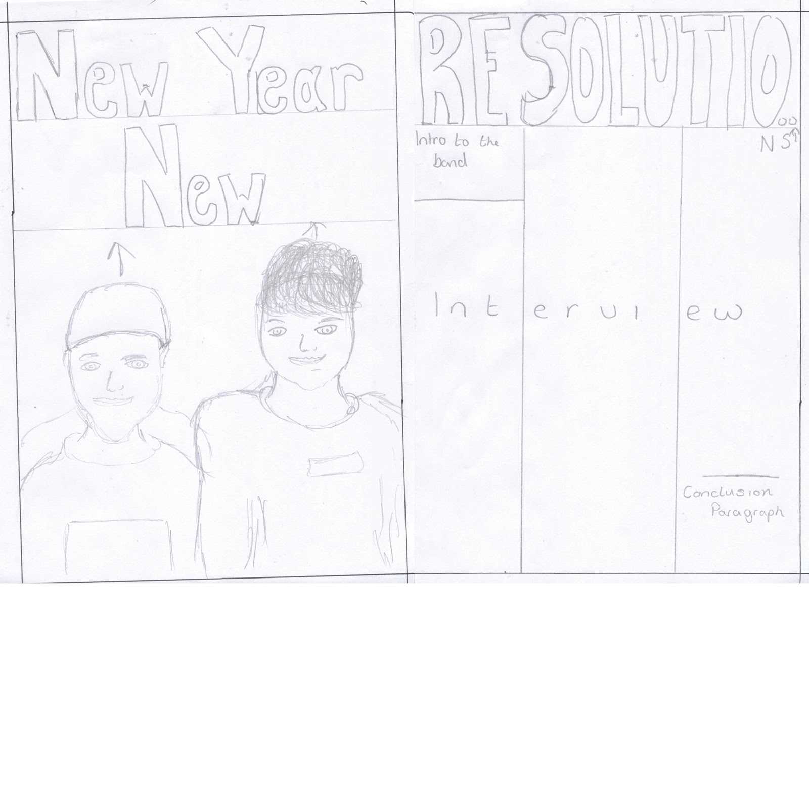
Through my research, I learnt that the majority of music magazine double page spreads share many common conventions (as can be seen in the Research part of my blog.) Some of these conventions include the way in which the pages are set out and the use/types of images on them. From personal research I found that there tends to be one main image which may span across both pages. I decided to use this layout in my own work by planning to get one main image and cropping it out so that it was just the one or two people, I felt that this would draw attention to them (gaze theory) and draw attention away from anything that could of been in the background. I decided early on that I wanted a simplistic type of approach on my double page spread, this is illustrated in my drafts as you can see there are only the main conventions roughly in place such as; a main image, a catchy title, and a section for an article.
No comments:
Post a Comment